A piece by Owen Vince originally published on Failed Architecture in January 2019 featuring an interview with me about Development Aesthetics.
While we frame most of our conversations about architecture through bricks and mortar, language continues to play an undeniable role in shaping how we actually consume it. As vast new developments mushroom within formerly out-of-the-way areas of cities across the world, and as increasingly larger parts of these cities are ‘museumified’—turned into relics and symbols—the main task of developers is getting people to live in, or simply to buy into, these destinations; these pristinely empty structures whose sole objective is to become filled.
District by district, developers transform the city into stainless new territories—territories that we could refer to as a type of terrain vague (as writer Ignasi de Solà-Morales has defined them). These sites are remembered—if they’re even capable of recollection—by obliteration, because in order to exist they must eradicate that which preceded them. Factories become warehouse apartments; low-income and council housing become luxury flats. And so it goes on.
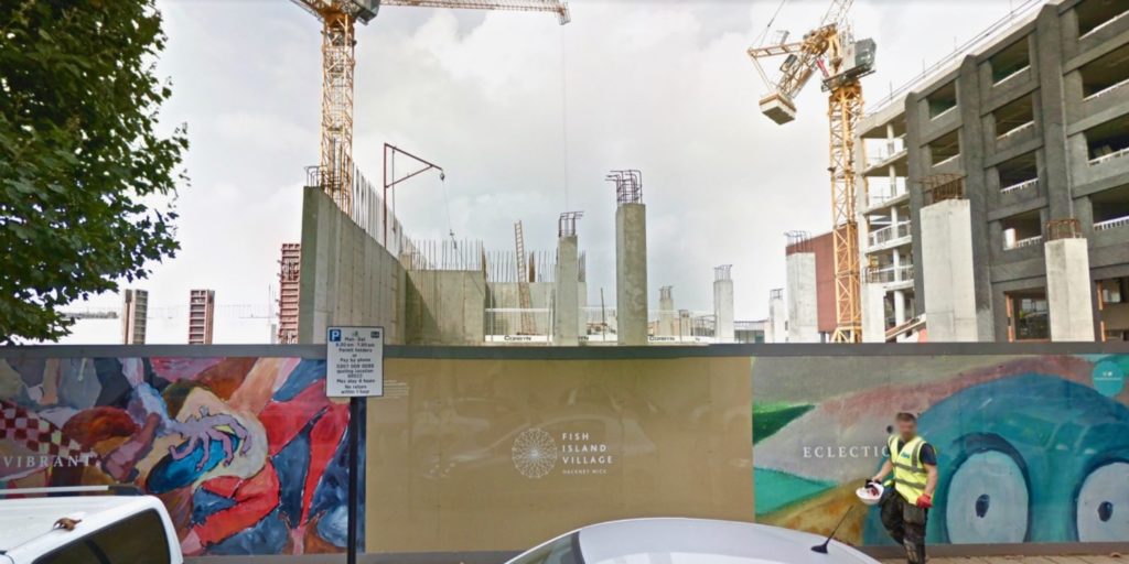
At the same time, this new architecture engorges itself on the memory of the old, laying claim to its legacy. In one part of East London (Hackney Wick, adjacent to the new-old Olympic park of 2012), a building called the Bagel Factory (it is neither a factory nor a bagel—another casualty of displaced labour) spotlights its ‘warehouse style apartments,’ and amplifies the ‘industrious history of the area.’ The industry, of course, has been pushed out, and the artists who made homes in the warehouses, too, have (been) moved on. Language, again, makes its move: printed on head-height hoardings which wrap around the bases of buildings, masking the ugly, intestinal work of construction, while telling stories about what it means to occupy these grandiose new apartments. I keep returning to a development in London’s Fish Island Village (guess what, there are no fish; and this is no village), whose hoardings, in the authoritative confidence of a serif typeface, state: “AUTHENTIC.” The full-stop seems to close down any kind of refutation. Beneath the text is an ambiguous ‘abstract’ painting and photo collage, featuring traditional styles of pottery and splodges of graffiti-esque paint. And in this way, the new development lays claim to the things it has destroyed, and eats their ghosts.
Entering into this noxious landscape is Crystal Bennes: writer, researcher, and the curator of Development Aesthetics—a popular and acerbic Tumblr blog that has accumulated countless examples of such sugary marketing around new developments. The images share many parallels with Reddit and Facebook communities Boring Dystopia and Shit London, while replacing their particular and drab muck with the schmaltzy stories sold to potential investors by architectural marketing firms. I quizzed Crystal about what constitutes the aesthetics of developments, and why it’s not a surface phenomenon that we can simply ignore.
Owen Vince: Briefly, how would you define ‘Development Aesthetics,’ if at all? In what ways is it a single, consistent visual style? What’s it trying to do?
Crystal Bennes: To be honest, I’ve never really explicitly defined Development Aesthetics. If pushed, I suppose I would say it’s the visual culture of marketing (almost exclusively urban) architecture. But you only have to glance through the Tumblr page—or look at hoardings when walking around cities—to see that language plays a huge part as well, so even though I say ‘visual culture’, language is obviously a crucial part of that culture.
When did you decide to use Tumblr to curate these images?
I started the Tumblr back in January 2013. Between 2006 and 2014, I lived in London. I lived all over the city, but I think around 2011 I moved to east London. By consequence construction hoardings were particularly prominent in that part of town and I found myself getting increasingly enraged by them. They definitely had a weird effect on me. It was like living with an out-of-control tomcat who insisted on spraying every corner in sight, only this tomcat marked territory with asinine hoardings rather than cat piss.
It’s strange that we think of hoardings as construction detritus and the buildings that emerge behind them as architecture. Something I’ve tried to suggest through DA is that hoardings are architecture. They’ve become as much a permanent part of cities as office blocks and Starbucks even if their location constantly changes. In the end, I realised that I needed some way to channel the irritation before I lost my shit and hence Development Aesthetics was born.
One of the things I realise, looking at the gallery and based on my own experience of this type of language, is that it’s an obvious kind of fakery; a delusion. Surely, nobody believes—in their heart of hearts—that a shining new development on a piece of leftover urban space is really ‘authentic, vibrant, eclectic.’ It’s a thin veneer. So where does this come from, and who is it being sold to?
I think it’s telling that the vast majority of development hoardings with these kinds of ridiculous slogans front residential developments. You occasionally see them on large office developments or cultural projects, but it’s mostly housing. I don’t think that’s an accident.
In terms of the delusion, I mean you have two sides to the equation. You have the PR and marketing teams who create these slogans and design these hoardings as part of broader marketing campaigns and they absolutely believe their developments are ‘authentic, vibrant, eclectic’. I’ve met people who work in the marketing departments at one of London’s bigger luxury apartment developers and does PR for huge commercial developers and they all talk about how much time they spend agonising over every word, every image used on the hoardings. I mean everybody thinks they’re the “good guy”, right?
Then you have the “audience”, the people who buy the properties, whether they’re overseas investors buying off plan or local buyers. It’s easy to look at these stupid slogans and think well, surely nobody believes in this crap, but 1) you and I aren’t really the target audience and 2) it clearly does work or the hoardings wouldn’t look the way they do.
I think the question of audience is super crucial. Most developers are pretty savvy when it comes to market research—they know their target demographic and they know how to speak to them. What seems cringe-worthy or insensitive to me is hardly likely to chime similarly with a prospective buyer.

Did you see James Bridle’s Render Search project? (where the artist attempted to trace the real people behind the ghostly stock figures who populate architectural renderings). Is this part of the same problem—of fake ‘utopias’ being projected onto containers that can’t ever hold them?
Yes, it’s a great project. I think we actually became interested in hoardings around the exact same time. Although James’s interest is perhaps slightly different to mine in that I think he sees architectural visualisations as fake or manufactured realities which need to be unpicked or undermined. I take the hoardings at their word as true depictions of a reality and then try to draw out the equally-real social and political issues which underpin each hoarding, each development. I never think about the hoardings as representations of some kind of utopia. As much as possible, I always try to root the hoarding in its very particular, very real local context.
I sometimes think that people miss out on the fact that, in addition to the images, there’s a huge amount of research on Development Aesthetics. Part of the reason why I post relatively infrequently these days is because it takes me so long to research and write up something on each development behind the hoardings. I read planning applications and local authority committee minutes and local blogs. I try to find out how much the developer paid the council in lieu of providing affordable housing. I try to find out how much the new developer paid for the site after the last one went bust. I work hard to try to show that the hoarding is much more than an annoying slogan; it’s often the developer’s sleight of hand in pushing one message over another.
Do you have a favourite example of development aesthetics—the best of the worst?
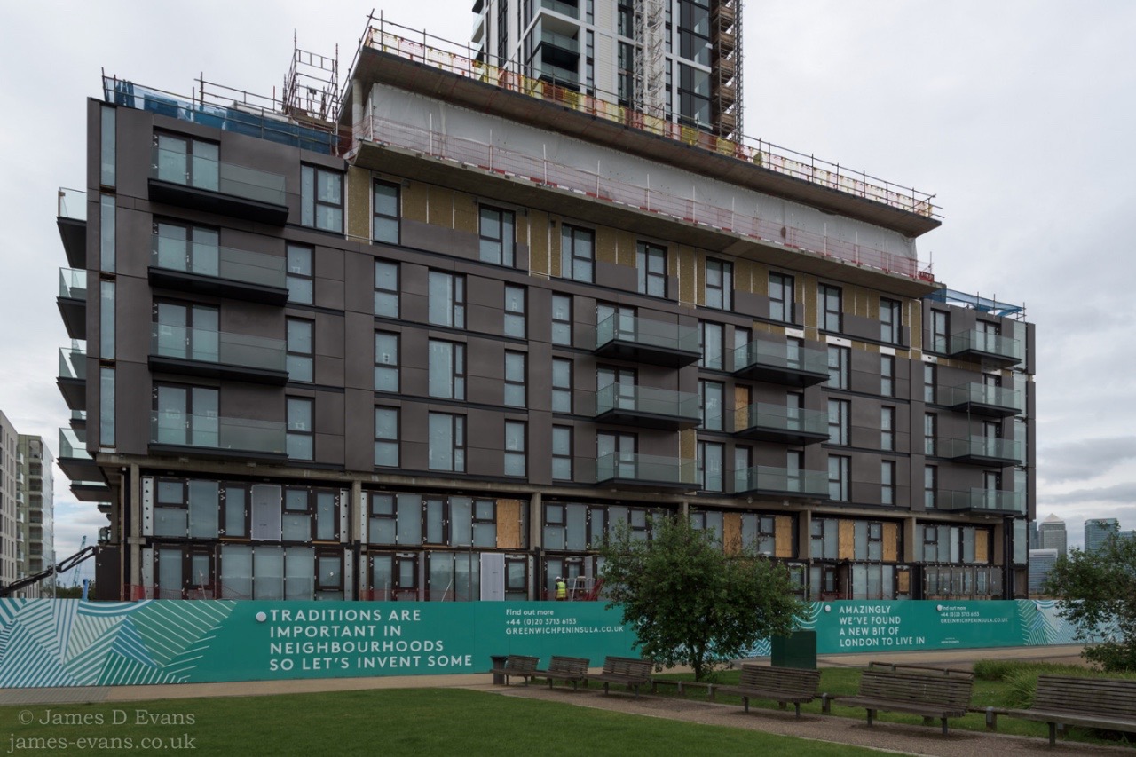
I love this whole series for Greenwich Peninsula. It was accompanied by a bunch of ads that ran in the Evening Standard and on the tube with manifest-destiny-esque settlers in horse-drawn wagons. Go West, young man! Absolutely indecent. But I think, again, it’s such a good example of audience. They were probably trying to target youngish bankers who might otherwise buy in West London. The kind of people who queue for the latest iPhone and go on mountaineering holidays, but who wouldn’t think of buying near Greenwich. And so you end up with this first-rate idiocy, advertising for early adopters masquerading as historical pastiche. Sometimes I have no idea how they come up with this stuff.
In terms of tropes, one of my favourite things to do is to follow the lifecycle of hoardings over the different phases of a development. With some of the bigger projects, the hoardings might change three or four times during construction and it’s always super interesting to see gradual, occasionally quite radical, changes in the way a particular property is marketed during that time.
It’s not really the aesthetic itself that is the problem here, is it? It’s what the aesthetic tries, awkwardly, to plaster over. Is that fair to say?
Yes, exactly. Hoardings are just a kind of set dressing hiding a whole host of much more serious problems related to urban development—affordability, availability, land banking, planning corruption or ineptitude, etc.
I keep coming back to Baudrillard’s discussion of simulation, in that he calls it a thing that is ‘no longer a territory.’ A model that no longer has an origin or reality. It becomes hyperreal. Are these apartments, and the marketing they’re selling, hyperreal? Do they actually exist? Can they?
It’s an interesting question. I grew up in the south-western US and there it’s the showhome, much, much more than the construction hoarding that dominates the marketing of new residential developments. Again, this makes considerable sense given the dominance there of both the car and the suburbs, just as the dominance of the hoarding makes sense in bigger cities where density and visibility give impact. Showhomes seem to play much more to this idea of simulation and the hyperreal. In high school, just for the sheer entertainment of it my friends and I would occasionally drive out to the latest show home and take a tour. They were so uncanny; perfectly lived in by the perfect family who just happened to step out immediately before we arrived. There’s something completely ridiculous about the show home and I think this ridiculousness means it’s perhaps less pernicious than the hoarding.
By contrast, I’m not so sure that the developments advertised on hoardings are hyperreal. I think they’re very real indeed. A certain group of people, myself included, mock them, but I think this mockery often overlooks the fact that buyers do believe, to a greater or lesser extent, in the lifestyle they’re buying into. Even investors have to believe in the power of that lifestyle to attract renters or future buyers otherwise why risk the investment?
If you think about other luxury goods—fashion or consumer electronics—compared to urban housing, what’s interesting is that the brand name is absolutely crucial in the former and almost negligible in the latter. By and large, most new urban residential developments aren’t selling themselves on the quality of their brand or the quality of their architecture (or the quality of their architect). Rather, they’re selling a lifestyle through a very carefully-staged interior perfectly pitched to appeal to the age, gender, income and taste of their target buyer.
That’s why with hoardings you get this interesting phenomenon where they start to act like mirrors or even cross sections, where idealised private interior spaces are made publically visible on the building’s exterior before it is yet built. It’s a complete contrast to the show home which maintains the boundary of private space, even while it allows the public to transgress that space, it’s still “private”. Hoardings invert the typical public/private relationship via the plastering of private space, usually an aspirational private space, all over the public domain.
Would you say there’s a history to this—a point at which it became a lot worse? Or is the worst yet to come?
There’s definitely a history, but it’s probably much longer than most people realise. When I was researching a few years ago, the earliest hoarding I found in London dated to 1928 on the site of what’s now Greater London House in Mornington Crescent. It was just a small sign advertising that thirty shops were being erected on the land, nothing fancy.
Personally, I only really started paying proper attention to hoardings in 2012. I’m sure they were just as annoying before, but at that time it felt as if they were omnipresent and insufferable. I do think designers and marketing teams have been paying attention to the increased critique (the London architecture/designer/developer world is a very small one…) and hoardings are slightly less objectionable than they were five years ago. I’ve definitely noticed trends. In general, there are fewer couples on hoardings, for example. They’re more slogan-driven, more word heavy. The name of the development in huge lettering, that kind of thing. As for whether it’s going to get worse, it’s difficult to say. It probably will.
What’s started to happen in the last two or three years is that the worst of the hoardings are turning up in Manchester or Birmingham rather than in London. As there’s been more market and public pressure on London’s luxe housing market, developers have started looking elsewhere. Last time I was in Manchester—maybe eight months ago—I was blown away by the scale of development. And by the ghastly hoardings of course!
Have you ever met the advertisers or designers behind these empty signs? Do you think they believe what they’re selling, or am I being naive?
As I hinted before, I think a lot of them do believe what they’re selling. Like this development by Peabody, I’m sure they 100% believe that they’re the good guys (compared to British Land and the other big devs, they totally are the good guys though) and that their development is authentic and eclectic. The rest of the developers might not believe in what they’re selling, but they do believe in C.A.S.H.


